Every module of the portal becomes a white card floating on a cool slate canvas — the bento style of the reference. Figures are set huge in a technical grotesk; color arrives only as full card-scale blocks and pill chips, each shade with one fixed meaning. Calm surfaces, loud numbers, instant orientation.
The canvas itself is cool slate — not white — so every card reads as a physical tile you could pick up. Cards carry no borders; the gap does the separating. Inside a card there is one number that matters, set 3–4× body size, and everything supporting it steps back to gray. The effect is futuristic without tricks: precision typography and disciplined color, not glows and gradients.
Canvas separates
No borders, no dividers. The slate background is the grid; white cards float on it with one soft shadow.
One hero number per card
Each card earns exactly one oversized figure. If two numbers compete, it becomes two cards.
Color = meaning, at card scale
A colored card is a statement: green for money moving well, blue for identity, orange for risk. Never decoration.
02 · Color
Three signals on slate
Freed from the literal logo palette, the system keeps the logo's spirit — green and blue still lead — and adds a third voice the reference uses so well: a vivid orange-red. In a payment product that auto-holds suspicious transactions, orange earns its place as the color of held, alert, attention. Nothing else is ever orange, so a single glance at any screen answers "is something waiting on me?"
Neutrals
Slate canvas#D8DEE6Page background
Card#FFFFFFEvery module
Tile#F3F5F8Inner tiles, hovers
Ink#0B0F14Text, primary buttons
Signals
Green#00B85C · #DDF2CEMoney in, settled, send actions, positive change
Blue#1F6BFF · #DCE8FFAccounts, identity, links, money out
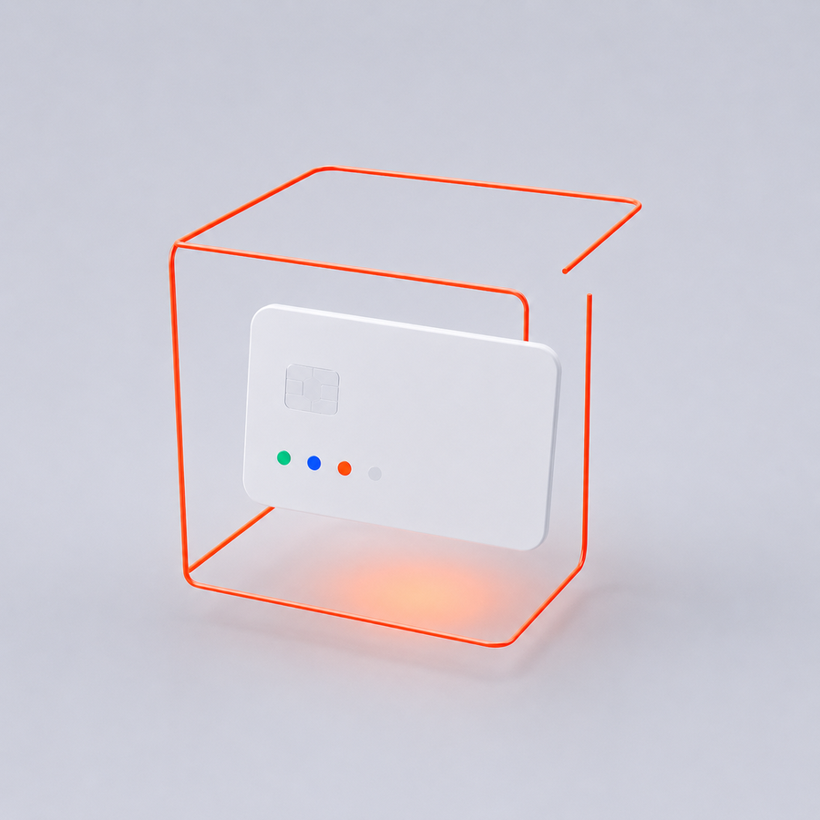
The hold, illustrated. A payment inside the orange frame is paused, not trapped — the cube is open on one side. This is the only place the interface softens a hard moment with an image.
Because orange appears nowhere else, the held state needs no explanation. The customer sees the frame, the amount, and one calm sentence — never the reason for the hold. The same illustration carries the notice on desktop and mobile, so the moment looks consistent everywhere it happens.
The hatch
The reference's diagonal hatch becomes our texture for not-yet: empty chart days, pending capacity, unfilled limits. It shows structure without faking data — a small futuristic tell that replaces gray placeholder boxes.
future days
unused approval limit
no data yet
03 · Typography
A grotesk that counts
Space Grotesk sets every headline and every figure — technical, slightly machined, with tabular digits so columns of money align. Inter carries body text and controls, invisible on purpose. Fira Code stays for references and IDs, the audit voice of the product.
Hero figure · SG 600 · 40$242,630.05
Headline · SG 600 · 26Approvals waiting for you
Body · Inter 400 · 13.5Your payment is held for a routine check. Most checks clear the same day.
Cards at 24px radius, inner tiles at 16px, every button and chip a full pill. Exactly one shadow token — soft, low, wide — used on cards only. Icons are thin outlines in ink, never filled, never colored unless they sit on a signal card.
Cards · 24px
Tiles & inputs · 16px
Buttons & chips · pill
05 · Components
The working set
Rendered live in the proposed tokens. Money moves in color: sending is always the green pill, receiving is blue, and ink handles the administrative rest — the eye finds the money button before reading a word. Orange still only ever means risk.
Buttons
Status chips
SettledPending approvalHeld — in reviewProcessingDraft
Inputs & transaction marks
↓money in↑money out⚠held
Navigation
▦ Dashboard
↑ Payments
✓ Approvals 3
⇄ FX & Convert
The active item flips to an ink pill — the same treatment as the primary button, so "where you are" and "what you can do" share one visual weight. The orange count badge is the only color in the rail: it marks work waiting, nothing else.
06 · Multi-currency
Every currency is a tile
The account is one pool of tiles — and the main settlement currency earns the blue card, the same treatment as the reference's debit card, so the wallet always has one unmistakable anchor. Every other currency is a white tile with a circular flag chip, one hero balance and a status dot; currencies you can open but haven't sit as hatched tiles. The wallet always shows two-and-a-half cards — the half card is the built-in invitation to scroll, and the rest of the currencies live in the carousel.
USD · Main
325,480.10
limit $500k/mo · **** 9090
EUR
18,345.00
ready to spend
MYR
96,210.55
12,400 clearing
GBP
42,880.00
ready to spend
JPY
1,250,000
ready to spend
CNY
0.00
Dormant — tap to activate
+Add currency
Converting between tiles
Quick convert
15,000.00USD ▼
⇅
63,120.00MYR ▼
1 USD = 4.2080 MYR · fee includedarrives Tue
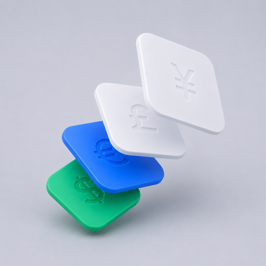
Exchange, illustrated. The FX page hero — currency tiles mid-flip, in the system's one material.
The conversion card is the one place two hero numbers share a card — deliberately, because the pair is the story. The rate line always shows the all-in rate with fee included and the arrival day before the button is pressed; the quote counts down and re-quotes rather than silently drifting. Flags are always circular chips, codes always in the mono voice, balances always tabular — so a row of ten currencies still scans like a table.
07 · Illustration
One material for every image
All imagery is a single commission: matte white plastic and frosted glass on the slate studio floor, signal colors only as small accents. Illustrations appear in exactly two situations — an empty screen inviting the first action, and the held-payment notice. They never decorate data screens; the numbers are the picture.
No payments yet. Send your first payment to see it here.No statements yet. Your first monthly statement lands on the 1st.No results. Try a shorter search or clear the filters.
Placement rule: images always sit inside a rounded tile at 640px source size, caption below in the interface voice — a bold statement of what's true, then one sentence pointing at the next action.
08 · Application
The customer portal as a bento
The prototype dashboard, widget for widget, recomposed in bento: total balance with the per-currency rail, the four quick actions, recent activity with live statuses, the action centre (approvals, questions from Glob, expiring documents), the banking calendar — and the orange held-funds card doing its job, impossible to miss.
app.weglob.net — preview mock
CUSTOMER PORTAL
▦ Dashboard
↑ Payments
✓ Approvals 3
⇄ FX & Convert
◫ Statements
Hi Farid 👋
Meridian Electronics · Thursday, 14 Aug
+ Quick actions🔔FAFarid · Maker
Total balance (approx.)
$438,035.65
of which $325,480 spendable now — the rest is clearing or reserved
USD
325,480
Main account
EUR
18,345
ready to spend
MYR
96,210
12,400 clearing
CNY
0.00
dormant
+Add currency
↑ Send
↓ Receive
⇄ Convert
◎ Payees
Recent activity
View all
↓Novatech Ltd Collection · 2h ago+34,343 settled
↑Shenzhen Parts Co Transfer · 5h ago−52,159 processing
⇄USD → MYR Rate 4.2080 · 1d ago+63,120 completed
⚠Kestrel Trading Transfer · 1d ago−48,120 held
Held for review
$48,120
1 payment · our compliance team is on it
Action centre
2 payments awaiting your approval
Question from Glob about PAY-2199
Expiring: Director ID — K. Lim
Banking calendar
Fri
CN holiday: CNY payments +1 day
Mon
EUR cut-off 15:30 MYT same-day
Glob cards
Order card →
GLOB
•••• 9090
Physical & virtual corporate cards for your team — spend straight from any currency tile.
09 · Two portals, one system
Same tiles, different lead color
Both portals share every token. The customer portal's money actions lead with green; the backoffice leads with blue for its identity and decisions. Orange means exactly the same thing on both sides of the glass — held, alert, attention — so a screenshot in a compliance report needs no legend.
Element
Customer portal
Backoffice
Money action button
Green pill
Blue pill
Primary / neutral button
Ink pill
Ink pill
Hero color card
Blue account card
Orange queue-pressure card
Orange
Held payments
Alerts, SLA breaches, rejects
10 · Mobile
Bento stacks, nav floats
Cards stack single-column in priority order — held-funds card first when it exists. The bottom nav becomes a floating ink pill, the most futuristic moment in the system and also the most thumb-friendly.
▦Home↑Pay✓Approve⇄FX☰More
11 · Rollout
What it takes to apply
Still a token-level re-skin of the working prototype: swap the color and type sheet, restyle rail and cards, place the logo, bump the asset version. Flows, screens and logic stay identical, and the regression suite runs before anything deploys. The prototype remains in its current style until you approve this direction.
No functional changesBoth portals in one passAwaiting your go-ahead
Design note: vivid orange on white passes contrast for large text and chips but not for small body copy — the system therefore never sets paragraphs in orange; it colors surfaces and lets ink do the reading.